Production analysis
The Production Analysis report provides statistics about products manufactured using Odoo’s Manufacturing app. The report is useful when trying to understand production costs, manufacturing durations, and other important statistics about manufactured products.
To open the Production Analysis report, navigate to .
Important
The Production Analysis report is one of many reports available across the Odoo app suite. This documentation only covers the measures specific to the Production Analysis report, along with a few use case examples.
For a full overview of the basic features available in most Odoo reports, see the documentation on reporting essentials.
Measures
Measures are the datasets that can be selected in the Production Analysis report. Each dataset represents a specific statistic about MOs in the database. Choose a measure by clicking the Measures button, and selecting one of the options from the drop-down menu:
The options displayed in the Measures drop-down menu, and the order they appear in, differ depending on the filters, groupings, and comparisons enabled in the Search… bar. By default, the available measures appear as follows:
Average Employee Cost/Unit: the average cost paid to employees to produce one unit of the product.
By-Products Total Cost: the total value of all by-products created by manufacturing the product.
Component Cost/Unit: the average cost of the components required to produce one unit of the product.
Cost/Unit: the average cost of producing one unit of the product, including component, employee, operation, and subcontracting costs.
Duration of Operations/Unit: the average total duration of operations required to produce one unit of the product.
Quantity Demanded: the total number of units of the product included in MOs.
Quantity Produced: the total number of units of the product that have actually been produced.
Total Component Cost: the total amount spent on the product’s components, across every MO for the product.
Total Cost: the total amount spent manufacturing every unit of the product produced so far.
Total Duration of Operations: the cumulative duration of every operation completed while manufacturing the product.
Total Employee Cost: the cumulative amount paid to employees to manufacture the product.
Total Operation Cost: the cumulative amount spent on operations required to produce the product.
Total Operation Cost/Unit: the average cost of the operations required to produce one unit of the product.
Total Subcontracting Cost: the cumulative amount paid to subcontractors to produce the product.
Total Subcontracting Cost/Unit: the average cost of engaging a subcontractor to produce one unit of the product.
Yield Percentage (%): the total quantity of the product produced versus the total quantity demanded, represented as a percentage.
Count: the total count of MOs created for the product.
Tip
Only one measure can be selected at a time when one of the (graph view) options is enabled. However, multiple measures, and varying group-by criteria (on the x and y axes), can be selected when using the (pivot table).
Use case: compare products
One of the best uses for the Production Analysis report is comparing statistics about two or more products. This is accomplished by entering the products into the Search… bar, then selecting the necessary measure, filter, and grouping, to see the desired data.
Example
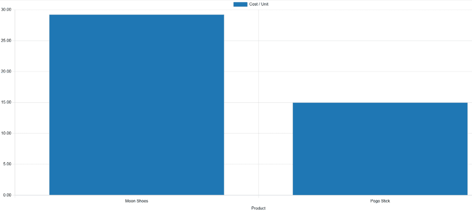
Toy manufacturer Tommy’s Toys is trying to reduce their manufacturing operation costs. To accomplish this, they have decided to identify redundant products and cease manufacturing the ones with higher operational costs.
Two of the toys that have been singled out for analysis are the pogo stick and moon shoes. Tommy’s Toys believes these two toys are so similar that they can stop manufacturing one, without significantly impacting their product offering.
To compare operation costs for the toys, business analyst Mike opens the app, and navigates to the Production Analysis page. In the Search… bar, he enters the names of both products. Then, he opens the Search… bar drop-down menu, and clicks Product in the Group By section.
Below the Search… bar, Mike clicks on the Measures drop-down menu, and selects the Total Operation Cost/Unit option. Finally, he selects the (bar chart) graph type.
With these options selected, the Production Analysis report shows a bar chart for the current year, with one bar for each product, signifying the average operation cost for one unit of the product.
With this data, Mike is able to see that the average operation cost for the moon shoes is almost twice the cost of the pogo stick. Using this insight, Tommy’s Toys decides to cease production of moon shoes, thus lowering their average cost of manufacturing operations.
Use case: compare time periods
The Production Analysis report can also be used to compare data for two different time periods. This is accomplished using the options in the Comparison section of the Search… bar.
Example
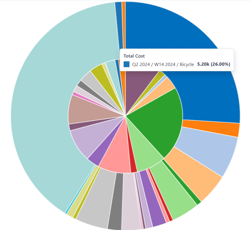
Furniture company Fanny’s Furnishings wants to compare their production costs for the first and second quarters of 2024, to see which products they spent the most money producing in each quarter.
To compare the two time periods, shop floor supervisor Adam opens the app, and navigates to the Production Analysis page. He begins by selecting the (pie chart) graph type option at the top of the page.
Important
The Comparison feature is meant to be used with the (pie chart) graph type, or the (pivot) view.
A Comparison option can still be selected with the other view types enabled, but doing so does not change the way data is displayed on the report.
Next, Adam selects the Total Cost option from the Measures drop-down menu. This option displays the total amount spent producing each product.
In the Search… bar drop-down menu, he leaves the 2024 filter enabled in the End Date section, and enables the Q2 filter as well. With both of these time periods selected, the pie chart shows data for the second quarter of 2024.
Finally, Adam selects the End Date: Previous Period option in the Comparison section of the Search… bar. Doing so causes the pie chart to be split into an inner circle, and an outer ring.
The outer ring shows data for the selected time period, quarter two of 2024. The inner circle shows data for the previous time period, quarter one of 2024.
Note
If End Date: Previous Year is selected instead of End Date: Previous Period, the inner circle shows data for the selected time period, one year previous.
In the case of this example, it would show data for quarter two of 2023.
Using this report, Adam can see that the products with the highest total cost for quarter two are the bicycle and tricycle. On the other hand, in quarter one, the roller skates had the highest total cost.